A Unique Approach: How I learned to use Calculation Groups in Power BI
- Jihwan Kim
- Nov 26, 2023
- 4 min read
In this writing, I like to share my experience learning how to use Calculation Groups in Power BI. Instead of adhering to the conventional approach, such as employing Calculation Groups for crafting time intelligence DAX functions, I've customized the application to align with my unique requirements. This transformative approach has helped me to elevate Calculation Groups from commonplace tools to potent assets with capabilities extending beyond typical use cases.
The solution I outline below to address my particular challenge isn't presented as the exclusive or optimal method. Nevertheless, I aim to highlight that Calculation Groups can be employed as a viable solution in similar contexts. This exploration aims to shed light on the versatility and effectiveness of Calculation Groups in overcoming specific challenges.
Included in this discussion is a straightforward sample semantic model, complemented by the attachment of the Power BI Desktop file at the conclusion of this blog post. As you delve into the contents, anticipate gaining not only insights into my distinctive approach but also an appreciation for the broader applicability of Calculation Groups in solving intricate problems.
For your convenience, you can find Microsoft's documentation on creating Calculation Groups in the link below.
Below is the semantic model I employed in this blog post.

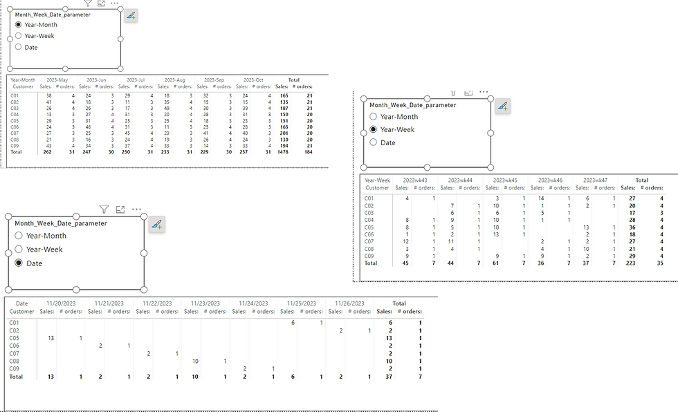
And, I've crafted three distinct visualizations, each offering a nuanced perspective on the data (by month, by week, and by date).

The initial task involves generating a column within a matrix visualization that dynamically adjusts the time period based on users' selections, offering options such as a monthly view, weekly view, or daily view. This challenge can be effectively addressed by employing a field parameter, as illustrated below.


A practice I adhere to when crafting a field parameter involves incorporating an additional column into the field parameter table to provide descriptive information for each category.

Subsequently, an additional request is presented to me, stipulating the following criteria:
- If users opt for the "Date" selection, display data for the most recent 7 days.
- If users choose "Year-Week," present information for the last 5 completed weeks.
- If users opt for "Year-Month," showcase data for the last 6 completed months.
While various approaches exist to address this challenge, I elaborate below on my chosen solution, leveraging Calculation Groups. Given that the Calculation Groups feature still remains in preview within Power BI Desktop, the initial step involves enabling this preview feature. Alternatively, external tools such as Tabular Editor can be employed for this purpose.

Select "Model View" and proceed with the following steps outlined below.

Similar to the example below, a new table has been generated. Proceed by renaming the Calculation Group.

Update the name of the column within the Calculation Group table.

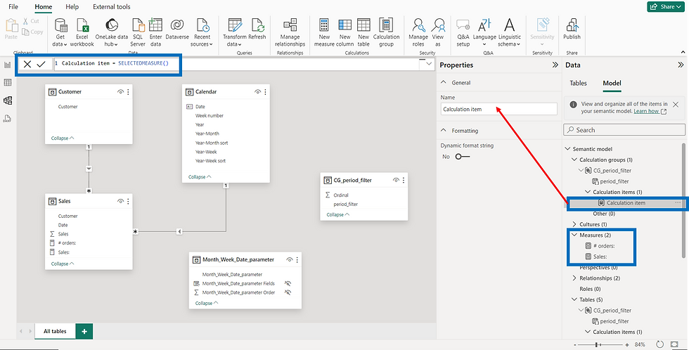
The initial appearance of the calculation item is illustrated in the figure below. In this instance, I have renamed it as "period filter" and crafted a DAX formula within the calculation item, as depicted. The noteworthy aspect here is the incorporation of the SELECTEDMEASURE DAX function, facilitating the simultaneous manipulation of two measures that I already have in the semantic model — [Sales:] and [# orders:]. This feature proves instrumental in streamlining the process.


period filter = VAR _lastdateinfct = CALCULATE ( MAX ( Sales[Date] ), REMOVEFILTERS ( ) ) VAR _sevendays = WINDOW ( 1, ABS, 7, ABS, FILTER ( ALL ( 'Calendar' ), 'Calendar'[Date] <= _lastdateinfct ), ORDERBY ( 'Calendar'[Date], DESC ) ) VAR _fivecompleteweeks = WINDOW ( 1, ABS, 5, ABS, SUMMARIZE ( FILTER ( ALL ( 'Calendar' ), 'Calendar'[Year-Week sort] <= _lastdateinfct ), 'Calendar'[Year-Week sort] ), ORDERBY ( 'Calendar'[Year-Week sort], DESC ) ) VAR _sixcompletemonths = WINDOW ( 1, ABS, 6, ABS, SUMMARIZE ( FILTER ( ALL ( 'Calendar' ), 'Calendar'[Year-Month sort] <= _lastdateinfct ), 'Calendar'[Year-Month sort] ), ORDERBY ( 'Calendar'[Year-Month sort], DESC ) ) RETURN SWITCH ( SELECTEDVALUE ( Month_Week_Date_parameter[title] ), "Year-Month", CALCULATE ( SELECTEDMEASURE (), KEEPFILTERS ( _sixcompletemonths ) ), "Year-Week", CALCULATE ( SELECTEDMEASURE (), KEEPFILTERS ( _fivecompleteweeks ) ), "Date", CALCULATE ( SELECTEDMEASURE (), KEEPFILTERS ( _sevendays ) ) )
Select the matrix visualization, and set up the filter on this visual as illustrated below.

Consequently, opting for Year-Month selection displays data for the past 6 completed months, Year-Week selection reveals information for the last 5 completed weeks, and Date selection showcases data for the past 7 days.

In summary, exploring Calculation Groups in Power BI has been an exciting journey for me. I've found new and smart ways to solve my unique challenges using these tools. This blog post shows how I used Calculation Groups in a different way, not like most people do.
One cool thing about Calculation Groups is that they can change the time period in my data based on what users choose—like monthly, weekly, or daily. I also used a handy function called SELECTEDMEASURE DAX, which made it super easy to work with multiple measures at once.
This blog post is like a story about how powerful Calculation Groups are and how they can change the way we look at and understand our data. Don't be afraid to try new things and see what works best for you. With Calculation Groups, there's a lot you can do to make the analytics toolkit more flexible. The journey of learning in the world of Power BI is ongoing, and there's always room to try new and creative things to make your data analysis even better.


Comments